SHAZAM!
Bringing users back to a time when the internet was fun.
Since 2002, the Shazam app has captivated music lovers by quickly identifying unknown songs. Unfortunately, user interaction is typically limited to 30 seconds (or less!) due to general unawareness that the app offers any other features. In my role as Lead Designer, I helped my team develop a research-informed design concept that celebrates the App’s 20 year history, draws attention to existing features, and incorporates a new chat function that allows users to interact without friends without leaving for another app. View prototype here.
Tools
Native App RedesignConcept ProjectTwo Week SprintLead DesignerResearcherTeam of 3
FigmaTrelloTeam
Project Type
Role
Duration
SlackZoom
This is the exciting story of how my team and I designed a refreshingly simple chat feature and retro interface that can help music lovers connect with their friends and welcome joy through music!
It is also a dramatic story of unmet expectations, panic, pivoting, and personal growth.
Though in the end, Shazam, formerly known as the case study, ends well. Stick around and we’ll walk through it together.

THE ISSUE
From Shazam’s perspective, the problem is simple and quantifiable. Keep users in the app for longer than 30 seconds. But that’s not the only perspective. The people who actually use the app are what drive it, so what’s the their problem?
My existing interaction with Shazam was very minimal. But when my team and I looked through the app together, I had some thoughts.

Whenever, Wherever
(There's Gotta Be) More to Life
After realizing the app lacks hardly any navigation buttons or any obvious menus, we figured Shazam probably did that intentionally due to lack of features. Why add pointless navigation if it leads to nowhere?
All were shocked when we found through competitive analysis that Shazam actually offers most of the features of other, more traditional music apps, and in fact has more features than all the other music recognition apps on the market. The fact that users leave the app quickly points to their respective lack of interaction with these features. Maybe some of that has to do with the lack of visual identity, and users’ preference for apps they are already familiar with.


Key takeaways so far:
Many existing features
Missing navigation
Lack of visual identity
This was great information to start with, helped answer some basic questions, and also helped to form some new ones. For instance, how might we draw attention to existing features? Can we do so in a way that also establishes a unique aesthetic and identity? But without really knowing our users, it was hard to decide what to do next, and we can’t move forward based on our own hypotheses alone. So we turned to folks who use Shazam most - people who love music!

THE USER

Don’t worry, the sticky notes were virtual [save the trees!] and you don’t have to read them all. After sorting through all the data, we found some clearly established trends.

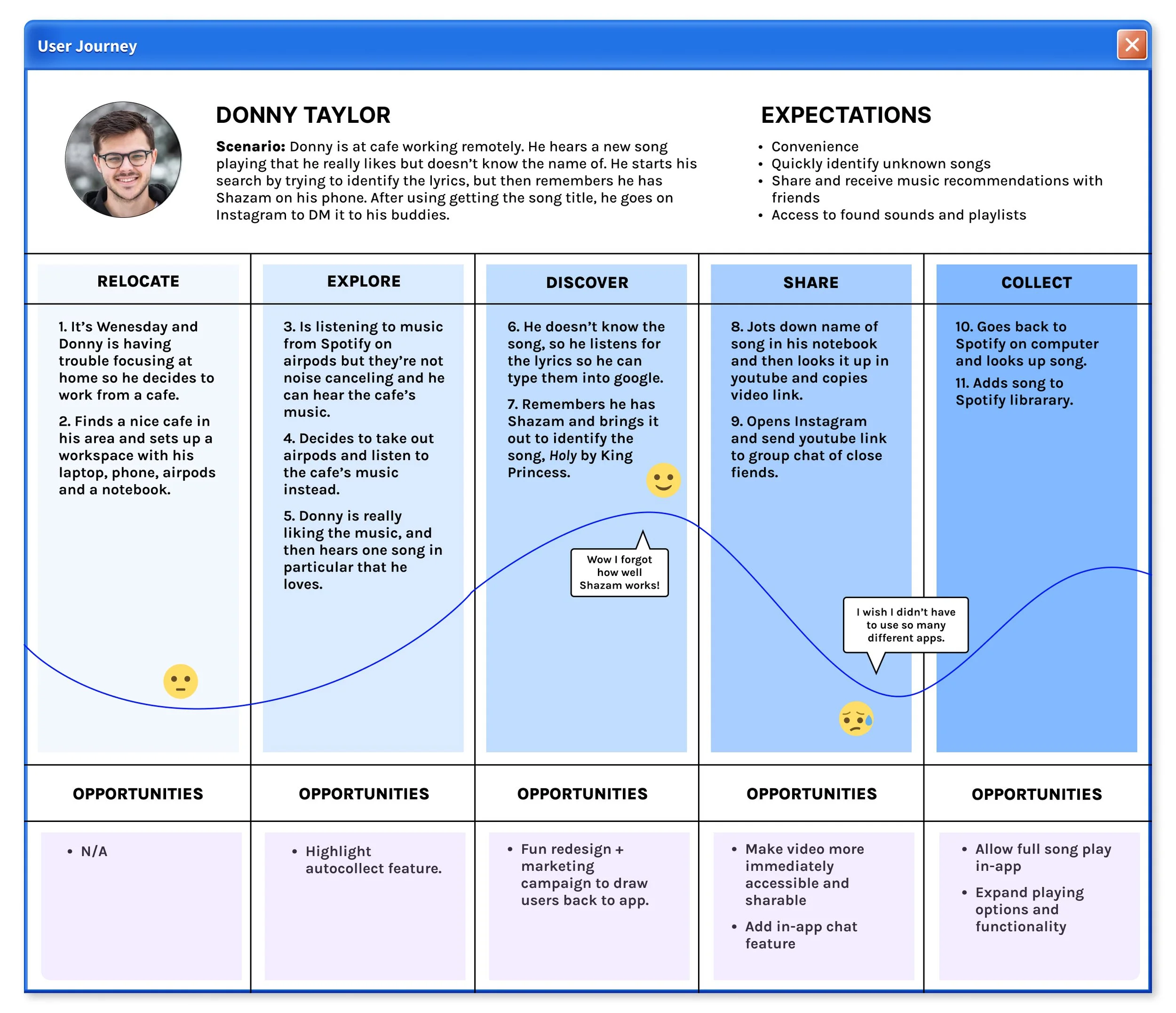
Bring Me to Life
Understanding Donny’s specific paint points was easier if we really put ourselves in his shoes. So I thought, ok, I’m Donny, I’m working remote and hear an awesome song, what next?
Gaining these insights about our target user allowed us to personify them into Donny, a remote worker who loves music and wants to stay connect with his buds.
Based on what we know from our research, Donny would use Shazam initially, but then bounce between at least 3 other apps to complete the task of sharing his newly discovered song with his friends. Not ideal.
Toxic

One of the apps Donny had to visit on his journey was Instagram, and I couldn’t stop thinking about the overwhelming number of responses that shared a love/hate relationship with social media.
Why are we even talking about social media, you might ask - this is a music app! Very true, but while gathering information from users, we found that the majority of those interviewed and surveyed spend the most time while on their phones on a social media app. However, this wasn't something users enjoy.
Many spend most of their screen time on Instagram, for example, and while they hypothetically like the easily consumable content, they hate the abyss of the endless scroll and the destructive social norms this creates.
One user interview described how Instagram specifically draws them back time and time again due to messaging with friends. This led me to wonder, how could we cultivate the wholesome connections in DMs without the toxicity of social media?
THE DESIGN
I Try
After 1 site map, 2 user flows, 4 design studios, and a lot of awesome ideas, we came to the basic structure of our redesign, and I went to work on developing our overall aesthetic.
We now had a lot of concrete data and clear direction. Tying together Shazam’s primary goal of keeping users in the app longer with our research informed questions, we focused on the following goals:
Reimagine the app’s information architecture and introduce navigation to draw attention to features
Overhaul the user interface so it is more appealing, dynamic, and fun to use
Introduce a simple, in-app chat function so users don’t have to leave the app for more toxic ones
While researching Shazam’s current UI, the longevity of Shazam kept creeping to the front of my mind. The fact that it’s been around since 2002 is very impressive. Some quick maths later and I realized that made 2022, the year of our case study, Shazam’s 20th anniversary as a live app. Hmmm…

Dan, Sarah, and I prepping for a rapid sketch session during one of our many design studios.Oops! I Did it Again
Our users are a mix of Gen-Z and Millennials, both of which, whether they like it or not, are currently immersed in a surprisingly long-lasting wave of early 2000s nostalgia. While first creeping back into style in fashion, it’s now apparent in digital design, music, and technology. Why not leverage this information to address our overall goals by packaging our proposed solution in a celebratory UI skin that is at once enticing, nostalgic, and encourages pure social interactions.

This approach would invite users back to a time when the internet was fun, and social media didn’t exist yet, so they would be more inclined to stay in the app and enjoy their music.
Drawing upon the aesthetics of early 2000s computer browsers, electronics, graphics, and fonts, I created a mood board and from there, our initial prototype.


All The Small Things
As lead designer, I was excited about this design, and for the chance to infuse a long-standing app with a current trend. My team was on board, we had a very cool working prototype, all was well…


…until we actually tested it with users. Turns out, what we thought was cool and exciting, they thought was confusing and frustrating. Some of this had to do with specific visuals, but most issues came down to size issues and lack of consistency.
Usability testing taught us:
Everything is terrible
We have to start over
Just kidding! Well, not entirely. It’s always hard to hear at first that your design failed in some way. But like all great design, iteration is necessary to grow and move forward. So, I had to set my pride down, encourage my time that all the feedback we received was really a win, and gave us a clear direction for moving forward - and move forward we did!
In addition to addressing size issues and inconsistency, we also simplified our information architecture and global navigation menu, used a toggle within the settings menu that makes the 20th anniversary skin optional, allowing users to turn it on or off at any given time.

Harder, Better, Faster, Stronger
In the end, we had a unique, colorful, wistful redesign that addressed our core problems, met our goals, and was responsive to usability testing.
I was disappointed to say goodbye to the windows that our users took to be pop-ups, so I was challenged with how to maintain a strong y2k aesthetic without them. This really came into play with our chat feature, where I took inspiration from some of the mobile phones of the early aughts and the defunct yet beloved interface of AIM (AOL Instant Messenger).
NEXT STEPS
This concept project was a super fascinating deep dive into why Shazam has been stagnant, and how to creatively address these problems.
Bye, Bye, Bye

As someone with a strong interest in UI and the impact it can have on a user’s overall experience, it was very exciting to experiment with high impact visual design and to begin to see both the positives and negatives in this approach.
Letting go of design decisions that I am passionate about is hard for me, and this project taught me to zoom out when this happens, and zoom back in on the user. A good idea isn’t bad because it has flaws - that just means there is opportunity to grow.
If I were to continue this project, I would run a second round of usability testing on the new prototype, conduct more research on where/how to place the auto collect feature, and develop UI onboarding to acquaint users with the new chat feature. Thanks for joining me, and happy birthday Shazam!